
1/05/2020 7:36 AM
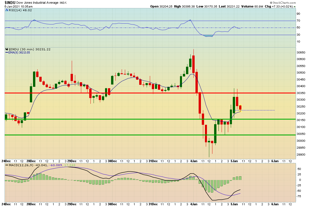
Good Morning folks! I wanted to drop a quick market dashboard update for some key levels I am watching on the 30 minute time frames.
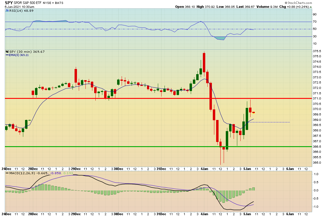
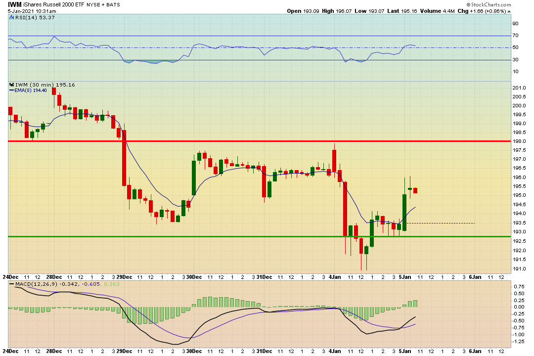
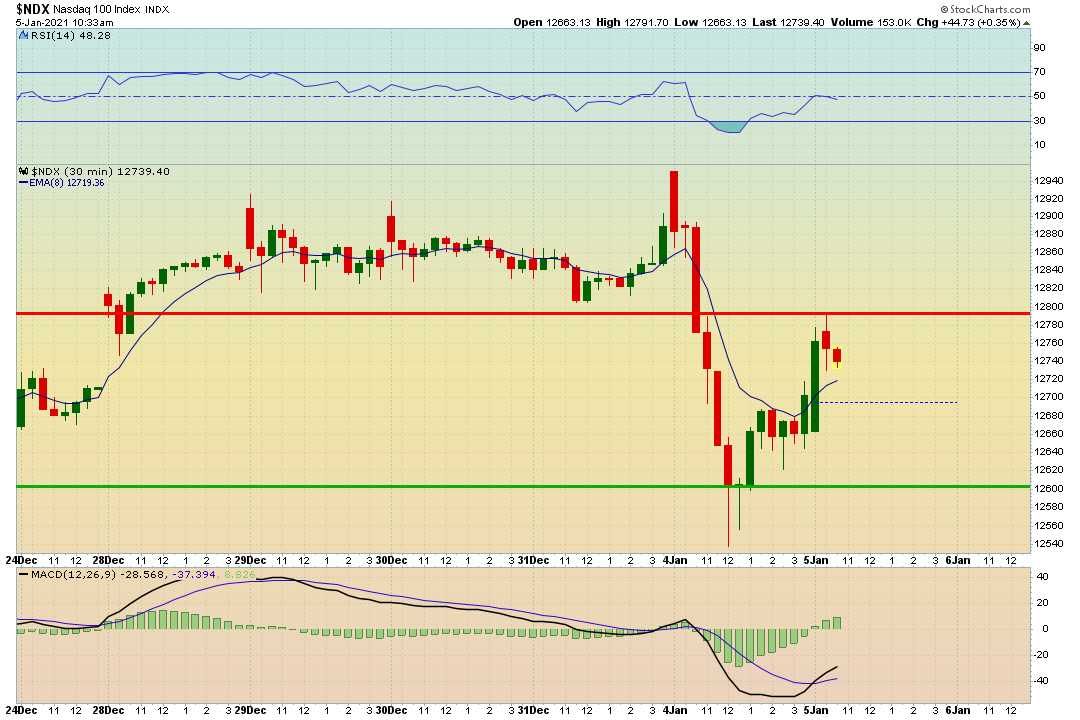
Each of the charts will have red and green lines on it and squiggly one. This is what each means.
- Green = Support
- Red = Resistance
- Squiggly Line = 8 EMA
By watching these levels it can help with making some short term trades. You can play bounces, breakouts, and even breakdown from these levels. Make sure to always have a stop loss in place. I have the 8 EMA up to show you that can be used as a trailing stop loss. It is a very short term trend. When price action gets above the 8 EMA you can have a stop loss below the low of the previous candle, or the 8 EMA (Whatever works best for you.
Here are the main indices to watch. The S&P 500 i find very important to watch when trading individual stocks. When The SPY is about to run into resistance, It might tell me that the stock I am trading might also has some hesitation up ahead.
Here are the charts:
Hope this helps! Also, If you want to see my charts from yesterday’s Market Brief I will post below.